We have refreshed branding and visuals across Ask Sona toward a warmer, more relatable feel—so the product feels less “tool-like” and more like a calm place to think with your personas. Marketing and the signed-in experience now live together on asksona.io, so the story and the app feel like one continuous world instead of two separate sites.
Navigation that stays out of your way
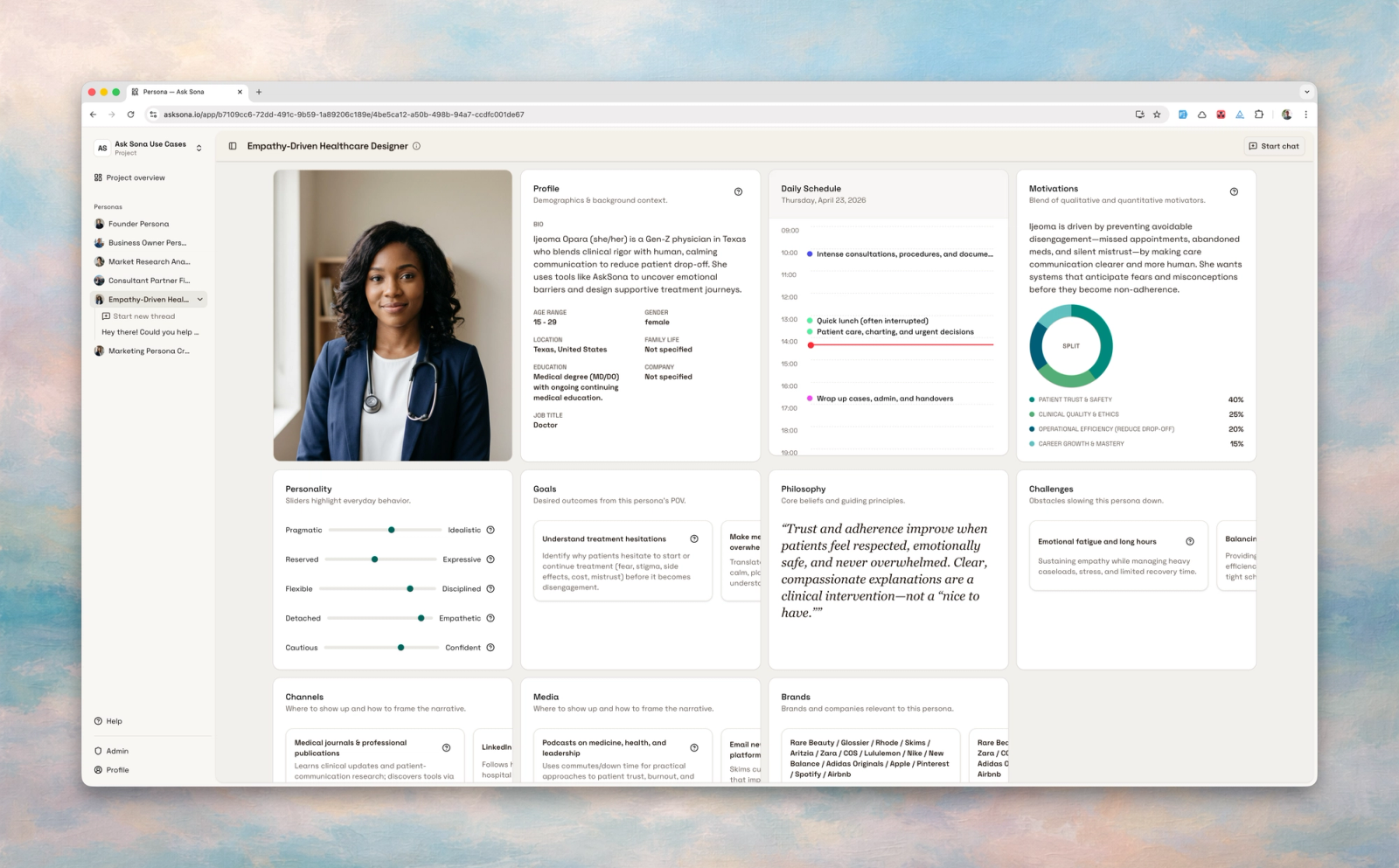
The product layout has been redesigned for more convenient navigation: clearer hierarchy, a sidebar that matches how you work, and less friction when you are switching between projects and personas.
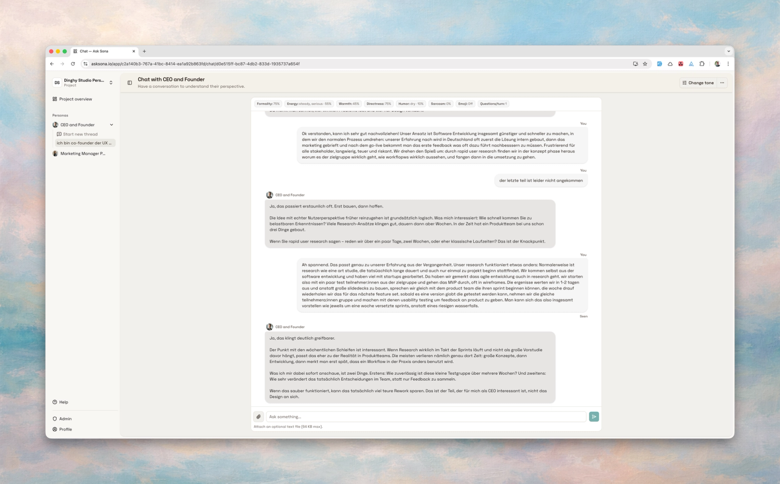
Threads you can grow—and tidy up
You can keep multiple threads per persona and move between them without losing context. The chat area is more spacious, so longer reads feel lighter. When a conversation is finished, you can delete it so your list stays manageable.
If you still open the old app address
Links and bookmarks that pointed at the separate app hostname are redirected to the main site, with product views living under /app. You should land in the same flows you expect—just with a cleaner, single home on the web.
Polish you will notice in passing
Empty states and dark mode read more clearly, typography and color feel softer and more human, and a few screens that used to feel “empty” now explain what to do next. Marketing picks up a demo clip where it helps, and error pages respect your language settings more predictably.
Under the hood (for the curious)
We merged the marketing stack and the product into one codebase and deployment pipeline. That is mostly invisible day to day, but it means we can ship improvements across the whole surface—including brand and UI—without them drifting apart.